Monday Mishaps (2)
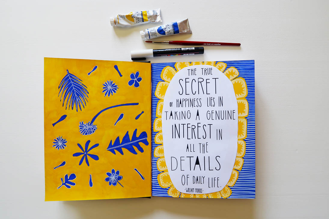
It’s time to come out of the closet. I love color! Something my folowers on instagram shouldn’t have missed. Despite my partiality for bright colors, I painted my new study white. The purple on the wall didn’t fit the bright and saturated colors I love so much nowadays. Now, the white color on the wall makes the bright colors pop. I’m very pleased with the result. My study is, at present, a creative, inspiring room, where I feel myself totally at ease.
Yet, I wasn’t completely satisfied. The room was a little bit too white for my taste. That’s why I gave myself the exercise to make a triptych for the place on the wall where my wedding pictures used to hang. It was required that the illustrations would fit both my work and the room.
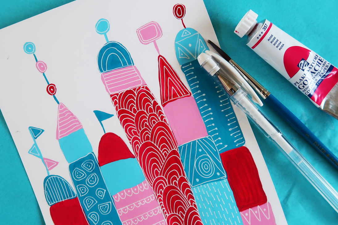
One of the frames holds the illustration with the text ‘Just Begin’. Two words that should move me to make things, without fearing the end result. (#perfectionist #easilydistracted) The dominant color in this illustration became turquoise. Each letter got a different color, which made a total of 7 colors in the color palette.
Oops, there I got myself a problem. I did not want a dominant color in the second and third drawing, but then I figured out, that without a dominant color, it was hard to match the seven colors between themselves. It was difficult to divide the colors in such a way there wouldn’t arise an imbalance or clashing colors. With Adobe Illustrator it was very simple to divide the colors randomly over the illustration. With one press of a button, the colors were redistributed. After multiple attemps, I produced illustrations with a terrible distribution of colors and illustrations in which the distributions were okay.
Finally I painted the illustraton in gouache and I’m pretty satistisfied with the end result, even though there was no illustration with a perfect distribution of colors. So… think about your color palette before you start designing a triptych, so you don’t get in to trouble later on in the process.
The creative process is hard. Now and then something goes right, but most often it goes wrong. I could write a daily blog about all my mishaps, but to keep up my selfesteem, I will post only once a week on this subject. At least until the moment when more things go right than wrong, but I think that will take a while.
Maandagse Mislukkingen
Het is tijd om uit de kast te komen: ik houd van kleur! Wie mij volgt op instagram was dat vast niet ontgaan. Ondanks mijn voorliefde voor felle kleuren, heb ik mijn nieuwe werkkamer een paar weken geleden toch wit geschilderd. De paarse kleur op de muur paste niet meer bij de felle, verzadigde kleuren waar ik tegenwoordig zo van houd. Nu zorgt het wit op de muur er voor dat de kleuren er uitspringen en beter tot zijn recht komen. Ik ben heel blij met het eindresultaat. Mijn werkkamer is een creatieve, inspirerende ruimte geworden, waar ik mij thuis voel.
Toch was ik niet helemaal tevreden. Ik vond de kamer nog net iets te wit. Daarom gaf ik mijzelf de opdracht om een drieluik te maken voor de plek waar voorheen mijn trouwfoto’s hingen. De eis was dat de tekeningen moesten passen bij mijn werk en bij de kamer.
In één van de lijstjes kwam een tekening met daarop de tekst ‘Just Begin’. Twee woorden die mij aan moeten zetten tot dingen maken, zonder te vrezen voor het eindresultaat (#perfectionist #snelafgeleid). De hoofdkleur in deze tekening werd turkooisgroen. De letters kregen ieder een andere kleur, waardoor het kleurenpalet uiteindelijk uit 7 kleuren bestond.
Oeps, toen had ik een probleem. Ik wilde namelijk geen dominante hoofdkleur in de tweede en derde tekening, maar zonder een hoofdkleur viel direct op dat de zeven kleuren onderling niet goed matchten. Het was moeilijk om de kleuren zodanig over de tekening te verdelen, dat er geen onbalans ontstond of dat de kleuren onderling vloekten. Met behulp van Adobe Illustrator was het eenvoudig om de kleuren willekeurig te verschuiven. Met één druk op de knop werden de kleuren herverdeeld. Hierdoor ontstonden er tekeningen met een verschrikkelijke verdeling van de kleur en tekeningen waarbij de verdeling nog enigzins om aan te zien was.
Uiteindelijk heb ik de tekening in gouache uitgevoerd en ben ik redelijk tevreden met het resultaat. In Illustrator kon ik echter geen één tekening maken met een perfecte verdeling van de kleuren. Dus… denk vóór aanvang van een drieluik na over je kleurenpalet, zodat je later in het proces niet in de problemen komt.
Het creatieve proces is zwaar. Zo nu en dan gaat er iets goed, maar vaker gaat het fout. Ik kan een dagelijkse blog schrijven over alle fouten die ik maak, maar om mijn zelfvertrouwen overeind te houden, houd ik het bij eenmaal per week. Tot het moment dat er meer goed gaat dan fout, maar dat zal nog wel even duren.